
Green frowning face proves more effective than skulls for safety warnings
The Ministry of Employment and Labor is providing financial support to small businesses to implement intuitive safety designs, inspired by the success of "Mr. Yuk" in communicating danger to children.
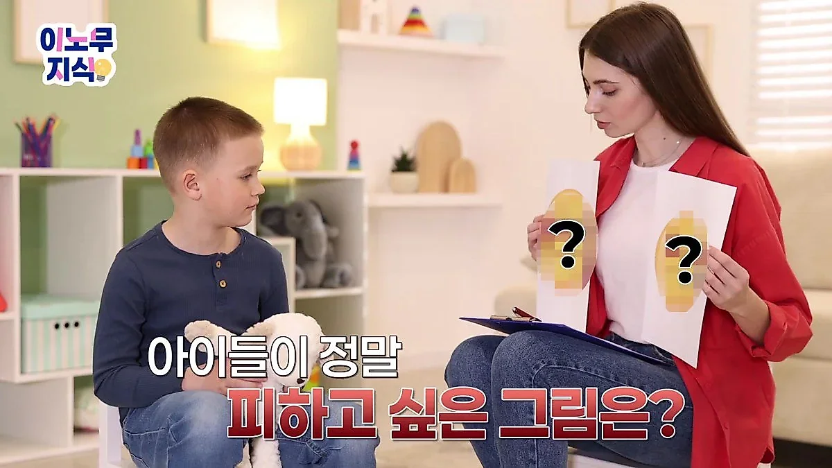
The Ministry of Employment and Labor is offering small-scale workplaces with fewer than 50 employees up to 70% of safety design costs to prevent cognitive errors, such as children perceiving skull danger symbols as familiar characters.
Analysis suggests that the skull mark, a representative symbol of danger, may actually lose its warning function. This is because scary skull drawings are perceived by children as familiar pirate characters. Based on such cases, the Ministry of Employment and Labor is emphasizing the importance of "safety design" that can immediately convey danger regardless of language or cognitive abilities, and has announced support measures for small-scale workplaces.
'Mr. Yuk' chosen over skulls: the power of intuitive repulsion
The skull mark, used for poison warnings since the mid-19th century, faced an unexpected problem in the United States during the 1970s. The skull drawings created to signal danger were objects of curiosity rather than fear for children. Factors such as the logo of the Pittsburgh professional baseball team, the Pirates, being a skull contributed to children perceiving the skull as a fun character rather than a danger signal.
To resolve this cognitive error, a pediatrician in Pittsburgh conducted an experiment. After showing children various drawings to find the one they wanted to avoid most, the result showed that a drawing of a green face caused a stronger repulsive reaction than skulls or stop signs. This green face, which frowns with its tongue sticking out, was designed using the color green, which children perceive as the most "unappetizing" color.
The drawing came to be known as "Mr. Yuk," reflecting the expression "Eww." It subsequently became established as a powerful warning tool, attached as stickers to items dangerous for children to swallow, such as detergents or medicines, allowing danger to be recognized immediately upon sight without verbal explanation. This serves as an example showing that visual elements can transmit danger signals to the brain faster than verbal descriptions.
Up to 70% of safety design costs supported for small workplaces
The Ministry of Employment and Labor is applying these principles of safety design to industrial sites. In workplaces with many foreign or elderly workers, immediate danger communication through colors and drawings is essential rather than long explanations. Representative examples include clearly distinguishing forklift paths from pedestrian walkways or visualizing danger zones and the locations of firefighting equipment.
However, for small-scale workplaces struggling to improve safety facilities due to cost issues, the Ministry of Employment and Labor provides support for safety design improvement costs through the Clean Workplace Creation Support Program. The target for support is small-scale workplaces with fewer than 50 employees. The scale of support ranges from 50% to a maximum of 70% of the required costs, with up to 100 million won available per workplace.
The support items consist of a single package of 19 types of safety designs, including 5 types of pedestrian safety and 4 types of fire safety. The Ministry of Employment and Labor is also operating a financial support program with simplified application documents and procedures so that workplaces where harmful or dangerous factors are discovered can complete improvements quickly. Eligibility and application methods can be checked through the Industrial Safety Portal of the Korea Occupational Safety and Health Agency.
Source: original video (YouTube)


0Comments
Comments are currently disabled.